Driving Engagement with Data: Using Data Visualization to Enhance User Experience
The Data Dilemma: Turning Information into Insight
Today, companies generate and collect vast amounts of data, ranging from government agencies tracking public initiatives to nonprofits managing donor contributions and impact reports to commercial entities tracking thousands (millions) of transactions and more. While data is a powerful asset, many companies struggle to translate complex datasets into actionable insights that engage their audiences – internally and externally. Without an intuitive way to visualize, interpret, and interact with data, valuable information often goes unnoticed, leading to missed opportunities for user engagement, informed decision-making, and potential monetization.
Data visualization is the bridge between raw numbers and meaningful narratives. A well-designed data experience can empower users, drive engagement, and even create new revenue streams by offering premium insights and analytics. So, how can organizations maximize the impact of their data?
The Power of Data Visualization in User Experience
Effective data visualization is more than just creating aesthetically pleasing charts and graphs—it’s about designing experiences that make data more accessible, intuitive, and engaging for users. Organizations that harness the power of data visualization effectively can:
- Enhance User Engagement – Interactive dashboards and visual storytelling keep users engaged, helping them uncover key insights quickly.
- Increase Accessibility & Usability – Clear and intuitive data presentation makes complex information digestible for a broader audience, including policymakers, donors, and customers.
- Strengthen Decision-Making – A well-structured data experience helps users identify trends, outliers, and correlations, supporting informed decision-making.
- Create Monetization Opportunities – Companies can package and offer premium access to valuable datasets, reports, or insights as a service to partners and stakeholders.
Key Strategies for Effective Data Visualization
To drive engagement and improve user experience, organizations should consider the following best practices in data visualization:
1. Start with the End User in Mind
Before designing any data visualization, ask: Who will use this data? What insights do they need?
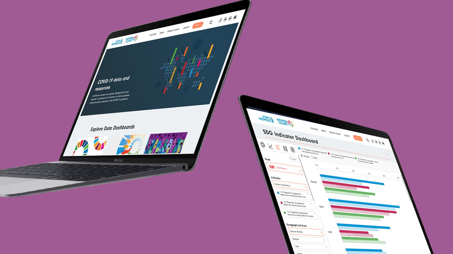
- An energy provider may want to build a real-time dashboard so customers can understand their usage patterns to help them save energy
- Nonprofits may need impact visualization tools to demonstrate progress to donors.
- A financial institution might want interactive reports to allow analysts to explore datasets dynamically.
Understanding the audience ensures that visualizations are tailored for maximum impact and usability.
2. Prioritize Simplicity and Clarity
Complex datasets can overwhelm users. Focus on clarity over complexity.
- Use intuitive color coding to highlight trends (e.g., red for declines, green for growth).
- Implement progressive disclosure—show high-level summaries first, then allow users to drill down for details.
- Avoid excessive data points—less is often more when conveying a story through visuals.
3. Make It Interactive
Static reports are a thing of the past. Interactive dashboards and visual tools allow users to engage with data in meaningful ways:
- Filters & drill-downs – Let users explore data based on parameters that matter to them.
- Comparative analytics – Enable users to compare trends over time or across demographics.
- Real-time updates – Ensure users always have access to the latest information.
4. Leverage the Right Technology
Selecting the right tools and platforms can make or break a data visualization project. Some of the most effective technologies include:
- Tableau, Power BI, and Google Data Studio – Ideal for enterprise analytics and dashboards.
- D3.js and Chart.js – Great for custom, interactive web-based visualizations.
- Flexible Content Management Systems (CMS) – Robust, flexible CMS solutions like Drupal, WordPress, and others that integrate data visualization seamlessly into other websites and platforms.
5. Ensure Data is Accessible & Compliant
Data accessibility is crucial, especially for public-facing organizations. Follow best practices to ensure compliance with WCAG (Web Content Accessibility Guidelines) and consider:
- Alt-text and screen-reader-friendly designs
- Color contrast for visually impaired users
- Mobile responsiveness to ensure usability across all devices
Monetizing Data Through Visualization
Organizations that invest in high-quality data experiences can unlock new revenue opportunities, such as:
- Premium Data Access – Offering exclusive, subscription-based access to high-value datasets or dashboards.
- Custom Data Insights – Creating tailored reports or analytics services for partners, businesses, or government agencies.
- Sponsored Data Platforms – Partnering with industry leaders to underwrite data-driven platforms and publications.
Final Thoughts: The Future of Data-Driven Engagement
Data visualization is no longer a luxury—it’s a necessity for organizations that want to make an impact. Whether the goal is to inform, engage, or monetize data, designing intuitive, interactive, and accessible experiences is key.
Insomniac Design builds user-centric digital platforms that transform complex data into powerful, engaging experiences. If your organization has a wealth of data but struggles to make it work for its users, we can help design a solution that drives engagement, accessibility, and revenue.
Let’s talk. Contact us today to explore how we can bring your data to life through thoughtful, impactful design.